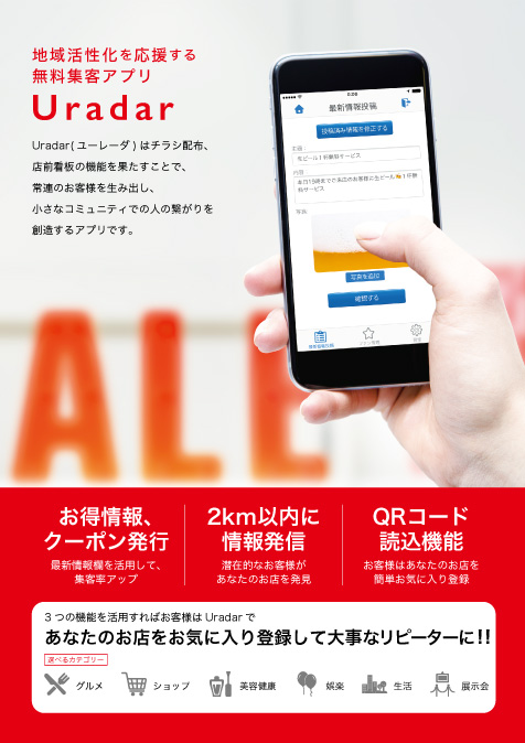
Uradar Flyer
| Type | Graphic |
|---|---|
| Year | 2016 |
| URL | - |
Along with its website, the flyer was also designed in the need of in-person marketing. The contents of it is same as website, however the paragraphs to explain the details have been omitted so that the very important parts, and features, can get more eyes of viewers.
The size of paper is A4. The main color red is inherently used from its logo and website. The 12 columns grid is used in order to achieve the visual communication systematically, logically, and aesthetically.

